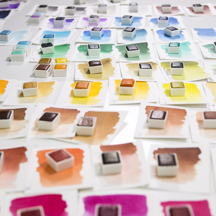
I swatched 244 colors to pick these 12!
When I selected the 12 colors for my custom watercolor set (check it out here), I swatched out 244 colors from a company in Korea. I narrowed it down to about 50 obvious choices, and then played with the colors for a few months. After a while, I was able to pull certain winners out. I selected colors based on transparency, vibrancy, and mix-ability.
Selecting a your personal paint color palette can be an involved, highly individual process. One of the most intimidating, tempting, and mind boggling places in the world is the well stocked art supply store. When you start buying high end paint, you usually buy it by individual colors. And depending on what line of products you are buying, there may be more than 300 colors to chose from. To make it more complicated, colors have different price points, and the paint colors may or may not look like the tiny swatch you’ll see on the package.
Are you ready to spend $15 for a tiny tube of paint that ***might*** be awesome???
One of the biggest journeys for any painter is to discover their own palette. When you’ve been painting for a while, you’ll find there are colors and combinations that you return to again and again. For instance, in watercolor, I tend to be a CMYK girl rather than a classic color wheel Red-Blue-Yellow. What in the heck does that mean, you ask???
CMYK & RGB are printing terms that get very technical, and there is some debate on what they actually reference when referring to analog color. To my mind, the classic color wheel primary colors are old school colors. CMYK refers to cyan, magenta, yellow and black. I tend to trend towards the “new” color wheel, using, brighter, hotter colors.
For those that know some things about color paint colors, there is a VAST difference between, say, red ocher (which is a ancient, classic color) and quinacridone reds. Quinacridone colors were developed in a lab by DuPont in the 1950s, and red ocher is a rock that artists have been grinding up since the neolithic.

Now, left to my own devices, I will use the quinacridone red all day long (although I’m still not 100% certain how to pronounce it), and won’t touch the ocher with a ten foot pole, unless I’m trying to paint a realistic trout. Which I don’t often do. It’s just personal preference and style at play here, and there’s plenty of artists who love the ochers who make incredible work.
Now, most standard paint kits start you off with very traditional, RGB colors. That may be a perfect fit for some, but since I’m a CMYK girl, those colors never work well for me. So I designed my own, modern paint kit for all you high key color types.
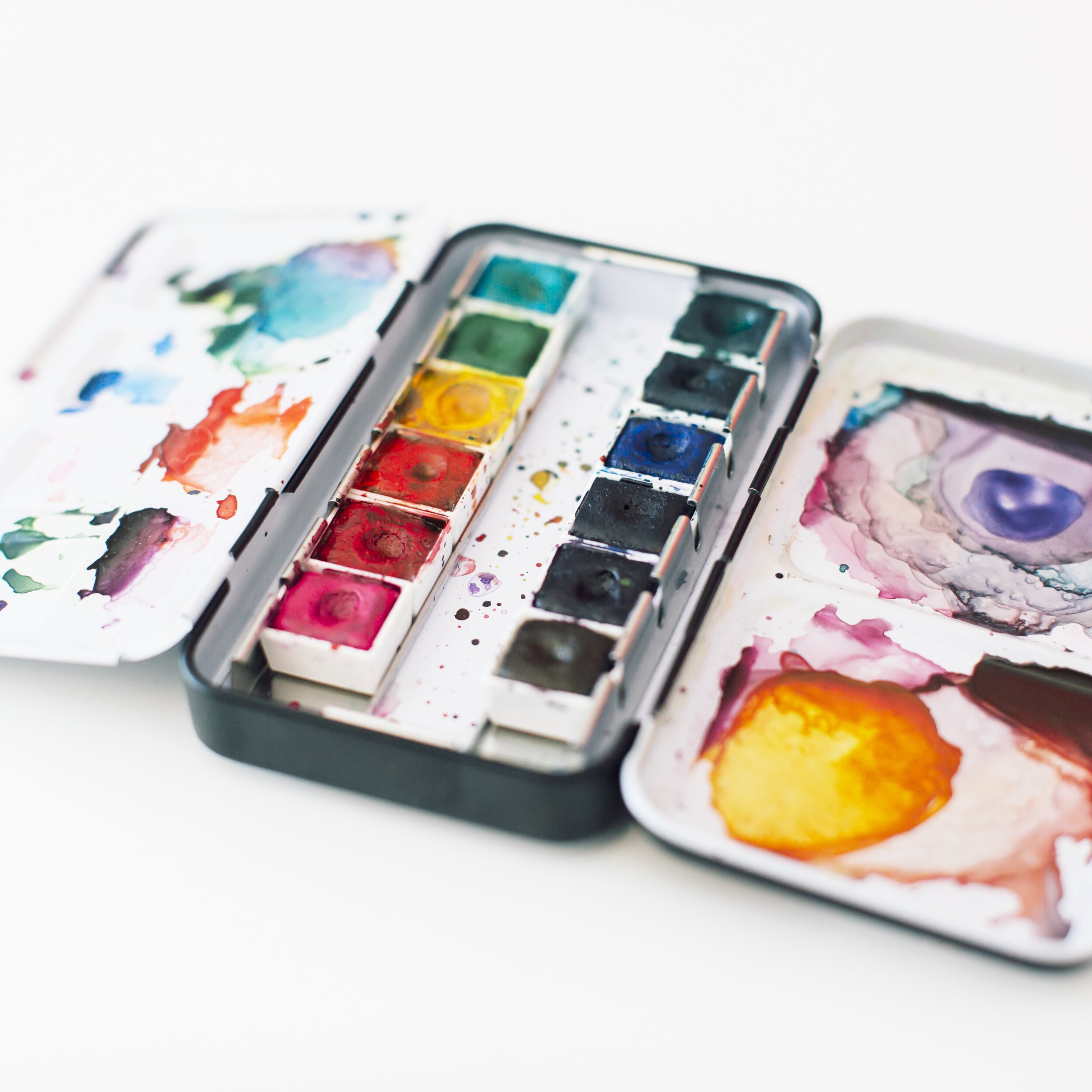
My 12 color watercolor set are pan paints with what I call “entry level professional” quality, and they are priced accordingly. They are better than your standard “student grade”, and not quite as fancy as Daniel Smith or other super high end paint producers. If you created a similar set with Daniel Smith or other high end watercolor sets, they would cost well over $100.
These colors are mostly lightfast (based on my own observations because lab data is not available), blendable, and don’t become chalky or dull when they dry. They layer well and don’t tend to get too muddy.
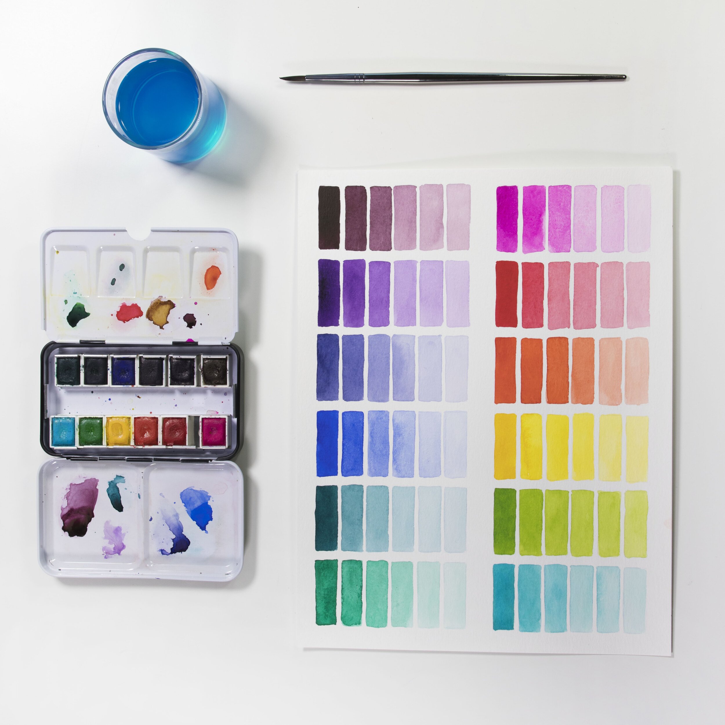
When I finally selected my 12, I worked with them exclusively for a few more months to make sure I liked how they behaved. And I did, and I do. I wanted to make sure that not only were they beautiful on their own, but that they were also beautiful in mixes. I wanted maximum versatility. Almost all the watercolor paintings I make these days are from this very palette.
A note on color names. I recently switched how I was referencing the colors on the swatch card to more accurately reflect the syntheticblends. The colors themselves haven’t actually changed since they were released a few years ago. The actual color recipes of these paints are made with various pigment blends.
In this list, I have included the number on the cartridge and also the Daniel Smith color that most closely will match my colors if you want to refill a color. I am not currently offering single order refills, but you can order professional colors from various providers that will be a fair match. Colors, even with the same pigments, can actually vary widely between providers, but I can vouch for Daniel Smith Watercolors as replacements.
The colors I ultimately chose are as follows:
Colors described are from top right and then clockwise.
Opera pink: This is as close to a neon pink that you can find in watercolor. It makes a gorgeous orange or a gorgeous purple when mixed and is extremely versatile for such a “hot” color. [In DS: same]
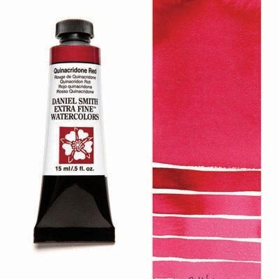
Reddish Coral: I have found it very difficult to find a true red that I enjoy in watercolor. Many times, classic red shades become quite muted or even muddy when they dry. This is similar to a Quinacridone because it trends just a tad towards the orange side of the spectrum, but still mixes well with the blues. [In DS: Quinacridone Coral]
Burnt Orange: This color is a bit more red than orange, and rounds on my red/pink spectrum [In DS: Transparent Pyroll Orange]
Lemon yellow: I’m not a huge fan of yellow, but what I require is a clean, transparent yellow that is not muddy or hazy. [In DS: same]
Phthalo yellow-green: This is the greenest, grassiest, spring green of a green. [In DS: same]
Sky blue: This is one of the only colors that isn’t rated as transparent in my kit. It can get a little chalky or muddy if overworked, but the vibrant bermuda beach blue is hard to recreate in other colors. [In DS: Manganese Blue]
Phthalo green (blue shade): The Phthalo colors return! Phthalo was invented in the 1920s, and I love the various types of phthalo because of the clear color notes they provide. Also I’m obsessed with teal, blue green, and turquoise in all its forms. [In DS: Same]
Ultramarine Turquoise: This is a deeper, more mature turquoise than the phthalo blue green. [In DS: Same]
Ultramarine Blue: This is a classic blue that blends an incredible purple. [In DS: Same]
Blue Jeans Blue: If your favorite blue jeans were a paint color, they would be indanthrone. This blue is a bit muted with a moody, potential murky affect. [In DS: Indanthrone Blue]
Royal Purple: For whatever reason, there aren’t a ton of purples available, and I’m REAL picky. This one is one of the most royal, queenly purples I could find. [In DS: Imperial Purple]
Twilight Maroon: This maroon is a bonus color that I think makes an incredible trifecta with the blue jeans and the deep water turquoise. [In DS: Napthamide Maroon]
If I HAD to, I could happily paint with JUST Opera Pink, Quinacridone coral, Lemon yellow, and Phthalo blue green shade. The color mixing potential in this quad has about everything I need.
I hope you consider adding this 12 color set to your watercolor collection, or start your collection with a fabulous bundle!
—Josie
